site archive
seresa's herstory. sadly incomplete because i didnt save every version of a page ive made u___u
version #4
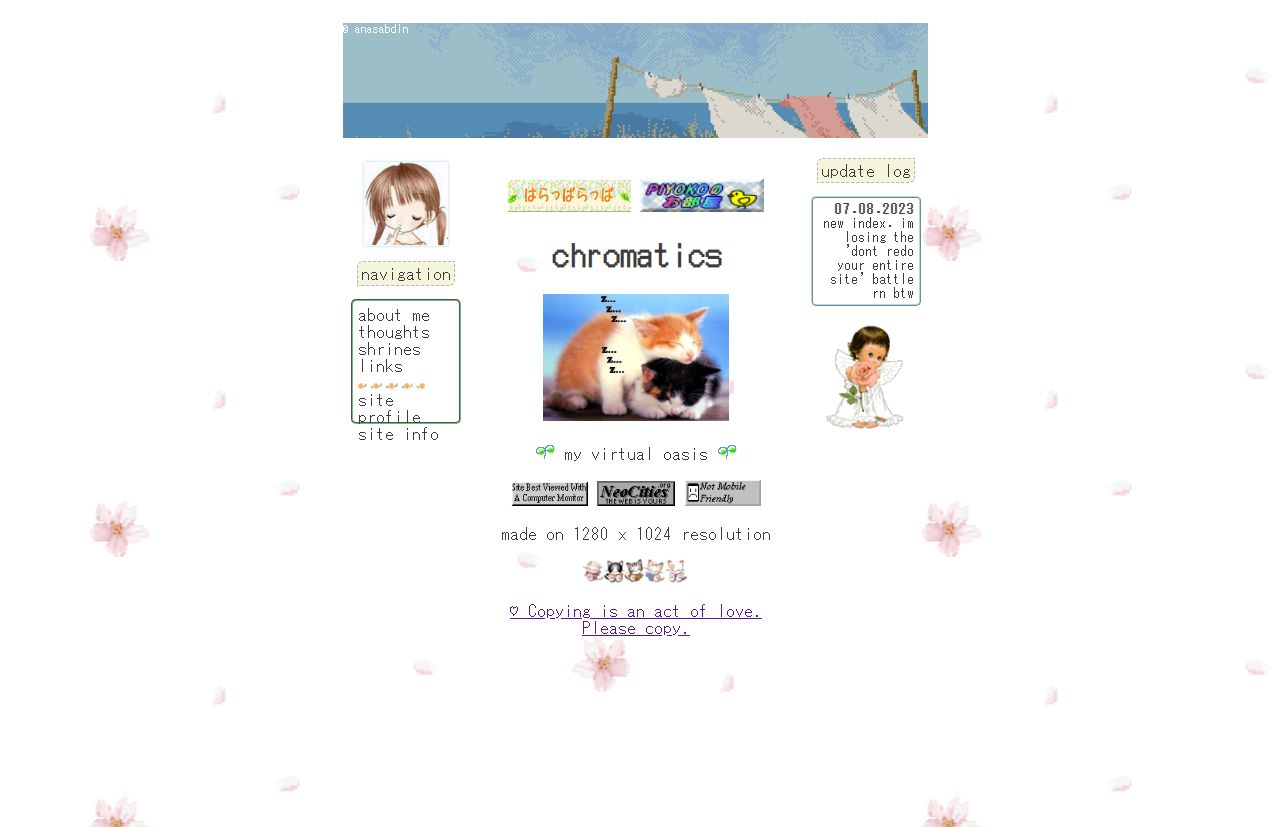
babys first font combinations!! i finally stopped exclusively using ms gothic here which subtly upgrade the site look, congrats to me for doing that XD i was really happy with the index page on this one because i managed to make it minimal the way i liked but still following the header-sidebar-footer website layout. i dont think i'll ever look at this and not like it, i was so proud of this :3 v5 was also important because i FINALLY worked on other pages and not just redoing the index over and over again i defeated the perfectionist demons in my head with this version. also the last version before changing from chromatics to seresa :P
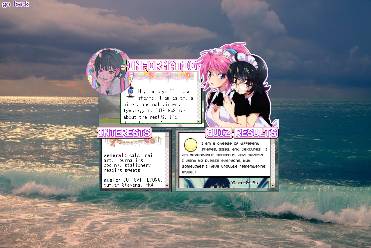
GODDD i love this about page so much. its so pleasing to look at. i remember there was a specific tumblr layout i took inspo from for this one but i dont have it saved.. shoutout to that layout. i originally wanted to do a green-pink color combo but as i was looking for backgrounds to use i stumbled on the one used here and i decided to use the dark bluegreen shades with pink and purple instead. the only problem i had with this one is that it felt too rigid since i couldnt add more containers to it
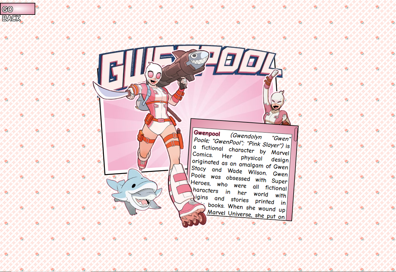
i made the gwenpool shrine in this version too. my idea for it was like gwen popping out of the page and the information would go on a speech bubble but then i didnt know how to execute a speech bubble so i just settled with a simple container. at this point, i still wasnt too into heavier designs hence why theres only a few notable elements in it.
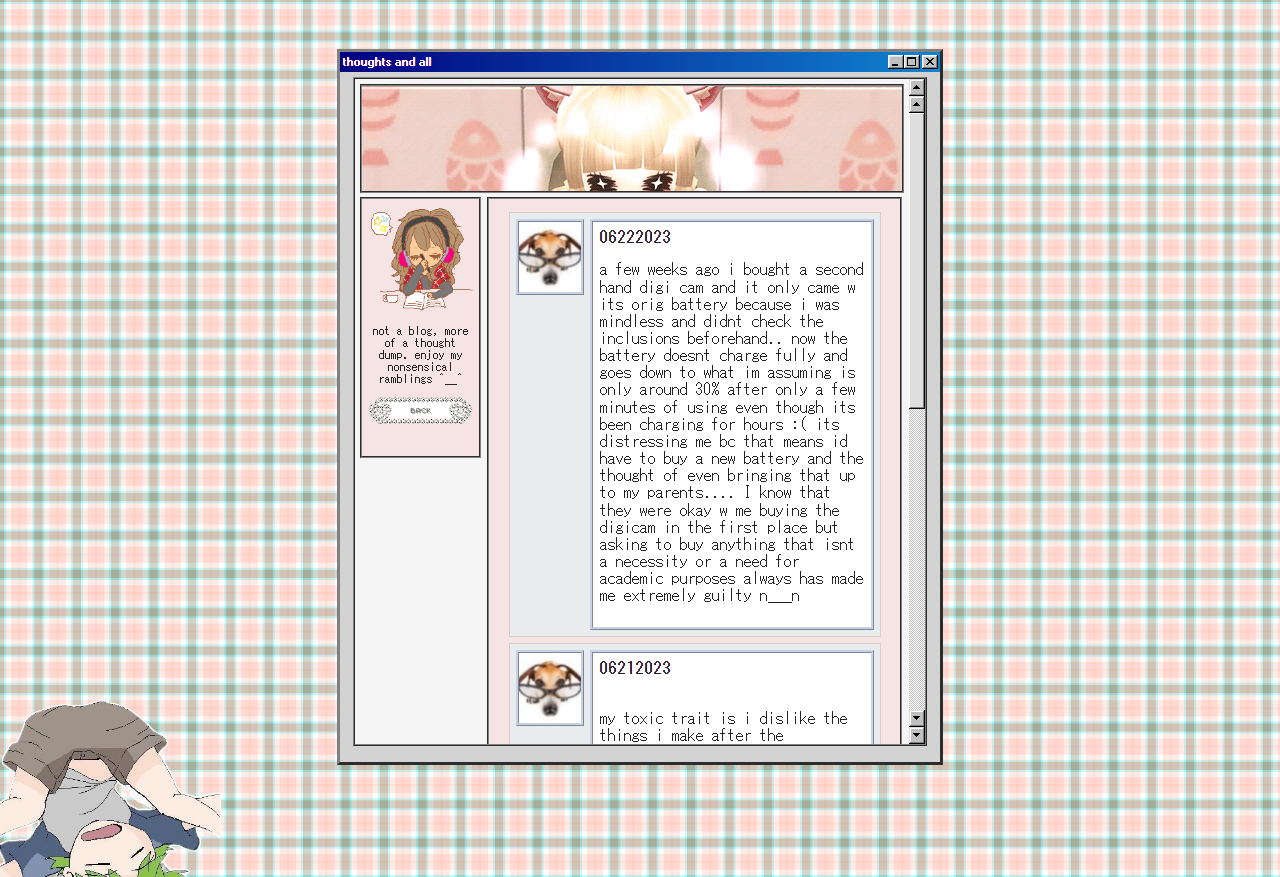
for this thoughts/blog page, i remember i took a lot of inspo from a pin i saw that was titled 'twitter if it was in the 90s' or something like that. i liked the soft pink+blue combo with the win98 here, but layout wise it wasnt the best for a page meant for long written entries since the space is too small. i tried not to be visually heavy with this one so theres more focus on the words but idt i did that right too LOL
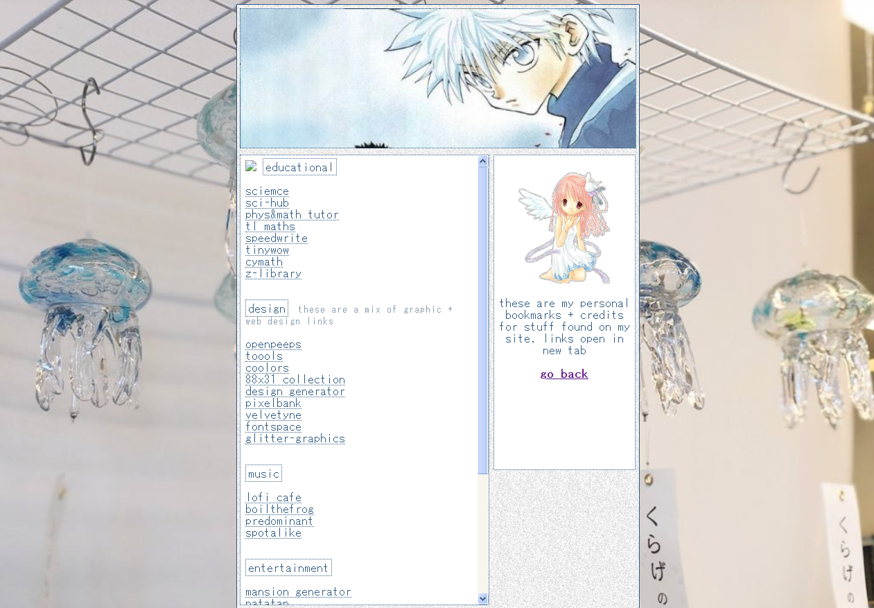
not much to say about this one, i just made it blue themed because the default link color is blue. this was a pain to do though bc of the amount of links i had to put hence why i titled it 'a href galore'
index #4

this is literally the only existing image i have of this index which is so sad because i really liked this one TT i tried the classic website look again with this one and went for a darker palette with red hints to match it with the album cover of closer to grey by chromatics. i cant remember how long this index lasted tbh but i think it laster longer than v2. this was fun to experiment with, id say this was the turning point of the vision i had for this site. i was more open to layouts that werent super minimal and i tried incorporating more graphics into my layouts.
version #3

i think by this version you can observe that i Really was into minimalistic design i heart negative space sm.. while i only made this one was a placeholder index i liked it alot but it was also coded piss poorly X__X i remember when i debuted this i was so sad because the grid size would change in every screen which i didnt account for while coding.

my first shrine.. i had such a great vision for this but the execution was not as great.. still proud of it though! for some reason this page made whatever device i viewed it lag like crazy idk why. i also dont know why the divs overlapped it was fine when i coded it in sublime text but it broke when i uploaded it to neocities..
version #2

this one is super silly. i discovered the classic header-sidebar type page here and i really wanted to use it but i had no clue what i wanted to put in the main section so i just put that massive picture to make up for space LOL. i dont have a ss of the about and links page during this version of the site unfortunately.. this was short lived too because while funny the massive picture irked me and i just wasnt happy with it at the time.
version #1

wow my humble beginnings.. this is v1. my initial goal with the site was something very minimalistic which is quite evident here. these pages were so poorly coded it was practically a crime since it was pretty much my first time making htmlcss pages without guides. first index page was heavily based off of turd since it was one of the first neocities i discovered I love you turd